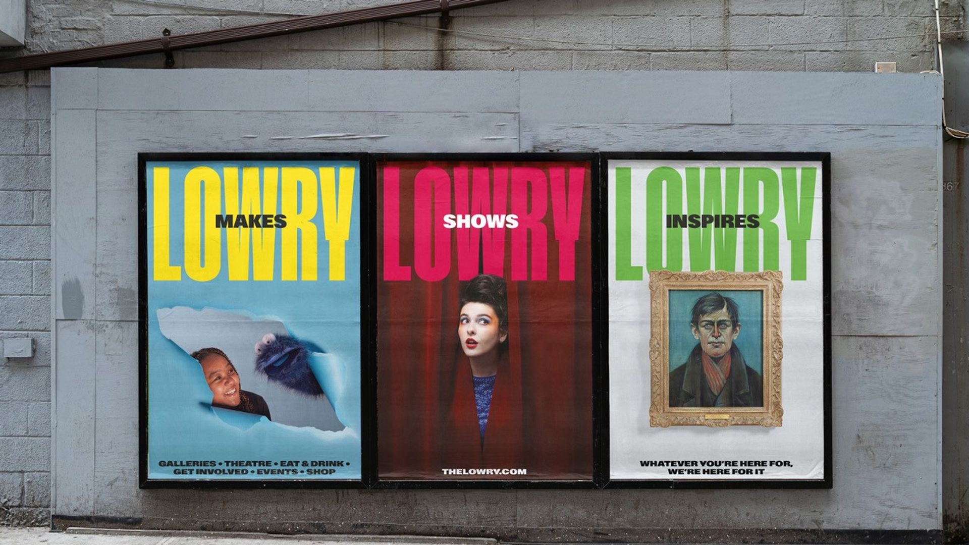
Our Rebranding Journey
In the early hours of 15th October, the excitement mounted as we huddled around our laptops in the office, waiting for the redirects to go live. After many months of work, our new branding and website were about to be revealed, and we couldn’t wait. The previous day was spent transforming our building with new signage and marketing collateral, and today, the website and online campaign would launch. The journey to this point had been long and sometimes challenging, but we were driven by our bold aspirations to reposition Lowry as a vibrant hub of creativity, accessible to all.
The pandemic had been a testing time for all, but it also highlighted the resilience of organisations that maintained strong brand loyalty and excellent customer relationships. Those that thrived during this period had one thing in common: they managed to stay connected with their audiences in meaningful ways. I had attended numerous conferences before the pandemic where the importance of brand and brand loyalty was discussed, and it became clear that we needed to shift our focus. Instead of merely selling tickets, we needed to tell Lowry’s story as an organisation.
We had a vast database of contacts, but our communications had always been centred around shows and exhibitions. I wanted to change this approach and lead with our own story, highlighting the essence of Lowry and what it stands for. This shift in focus was not just about rebranding; it was about redefining our relationship with our audiences and ensuring that every interaction they had with us was meaningful and reflective of our core values.
During 2021/22, we worked with Sarah Chambers and Jo Marsh, to consult with our own teams and over 444 stakeholders, including partners, communities, participants, and audiences. Their probing questions and the honest feedback we received revealed both loyalty and pride but also feelings of inaccessibility. We realised the need for clear direction and purpose, which lead to a review of our Mission, Vision, and Values.
Moving forward, Reed Words helped refine our tone of voice, ensuring it resonated with our diverse audiences. And for the visual identity, we collaborated with EDIT, who developed a fresh, vibrant, and welcoming design. The font was influenced by our heritage, and the colour palette was inspired by our building. This new identity was the result of extensive consultation and some debate, but it perfectly captured the essence of Lowry.
The success of the Julia and Axel - Thirty Years of Favourite Stories family exhibition in 2023 took us all by surprise. The visitor numbers were incredible, and the operational demands meant it was a very “hands-on” six-month period for everyone. In early 2024 we picked up the project again. We needed a new platform to showcase our brand and communicate better with our audiences – we needed a new website. After another tender process, we chose Culture Suite, whose exciting ideas opened up many opportunities for our future digital engagement.
As we approach our 25th birthday in 2025, our new tagline, “Whatever you’re here for, we’re here for it,” reflects our commitment to a brighter, bolder identity. We have welcomed over one million visitors annually and engaged with more than 30,000 young people through our community programmes. But our goal is to reach even more people and make them feel that Lowry is a place where they can experience and grow through creativity.
I would like to thank my incredible team that have been on this journey with me- Zara, Tim, the designers and digital teams - there are too many to name but they each know who they are and the role they have played. For the organisation this journey is only just beginning, and the real work starts now as we embrace our new identity, live our values and continue to offer our warm Salford welcome to all who encounter Lowry. Here’s to the next 25 years!!
Rachel Miller,
Director of Audiences, Sales and Marketing


